
The Chiro Studio
Brand Identity & Graphic Design
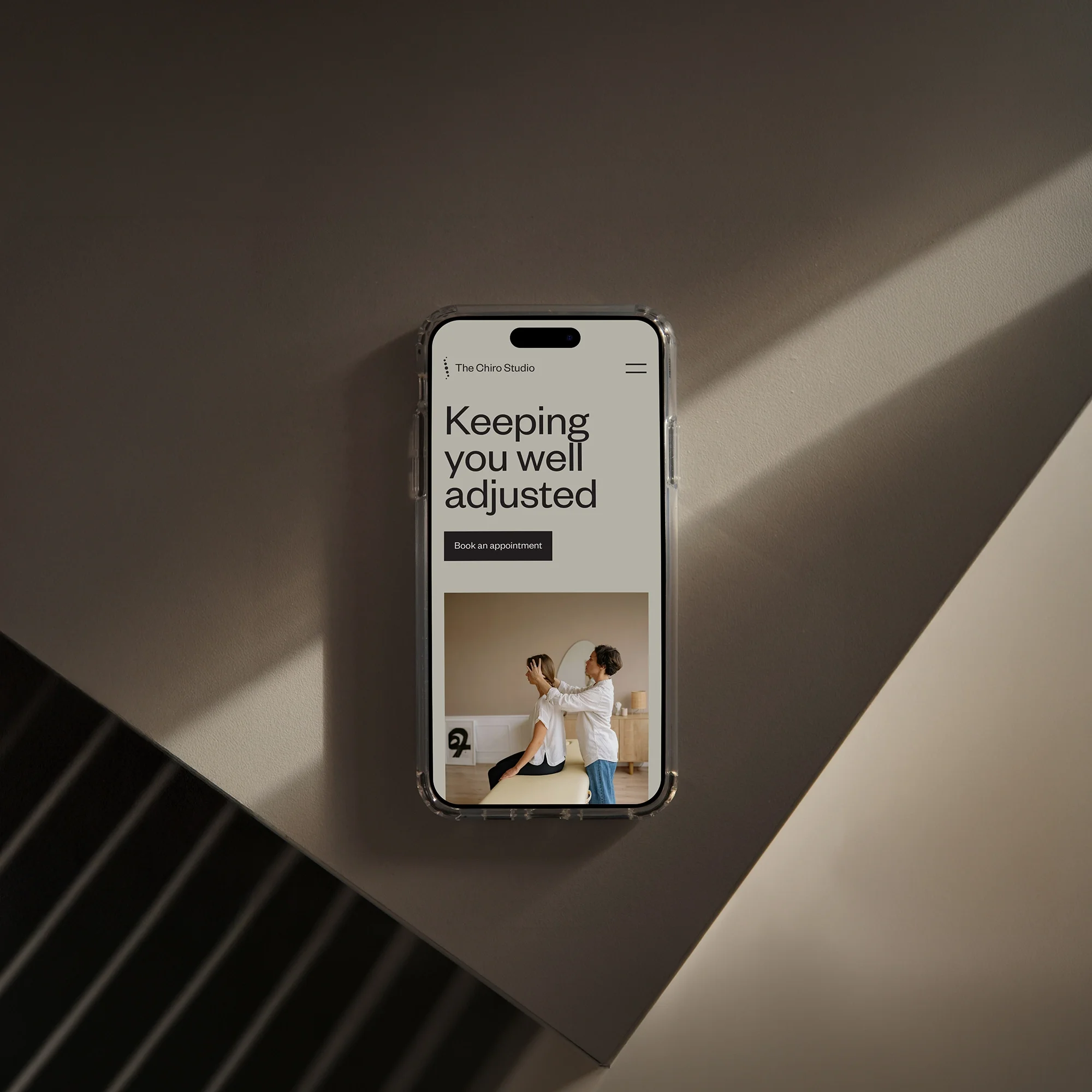
The Chiro Studio began with a DIY brand that helped get the business off the ground, but as the practice grew and moved into a new space, the branding no longer reflected the level of care they provided. The existing identity felt generic and lacked the flexibility needed to support future growth and build trust with new patients.
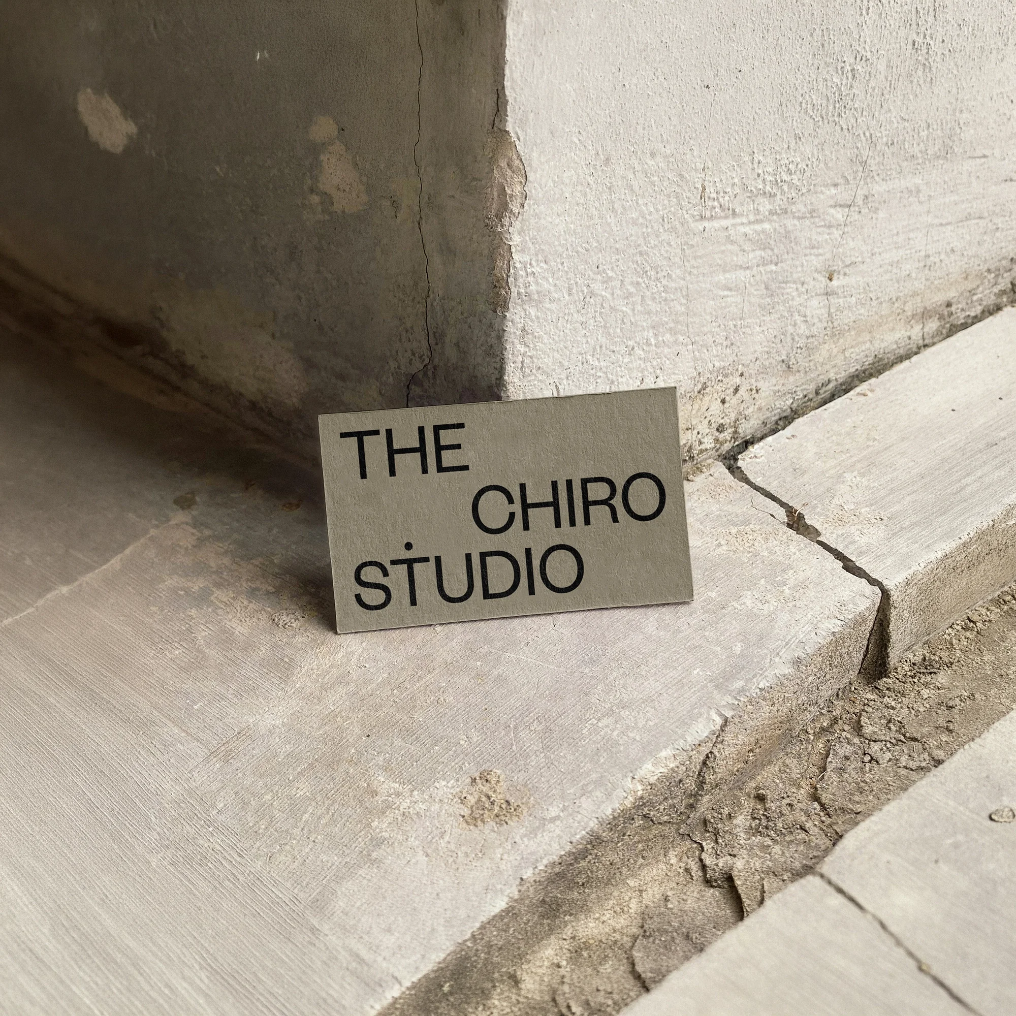
The rebrand was designed to create a calm, modern, and trustworthy presence that reflects The Chiro Studio’s approach to family-focused care. Using a neutral colour palette and thoughtful design details, the new identity helps communicate a sense of competence, warmth, and professionalism, while giving the business a stronger foundation for future growth.
Auckland, NZ


Services
Branding
Brand strategy
Naming
Brand identity
Logo design
Brand guidelines
Art direction
Brand audits
Brand positioning
Iconography
Creative direction support
Ongoing brand consultancy
Business cards
Stationery design
Brochures
Flyers
Posters
Packaging design
Menus
Labels
Event collateral
Signage
Promotional materials
Digital
Website design
Social media design
Email newsletter design
Digital ads
Out-of-Home (OOH)
Presentation decks