
Conifera
Brand Identity & Packaging Design
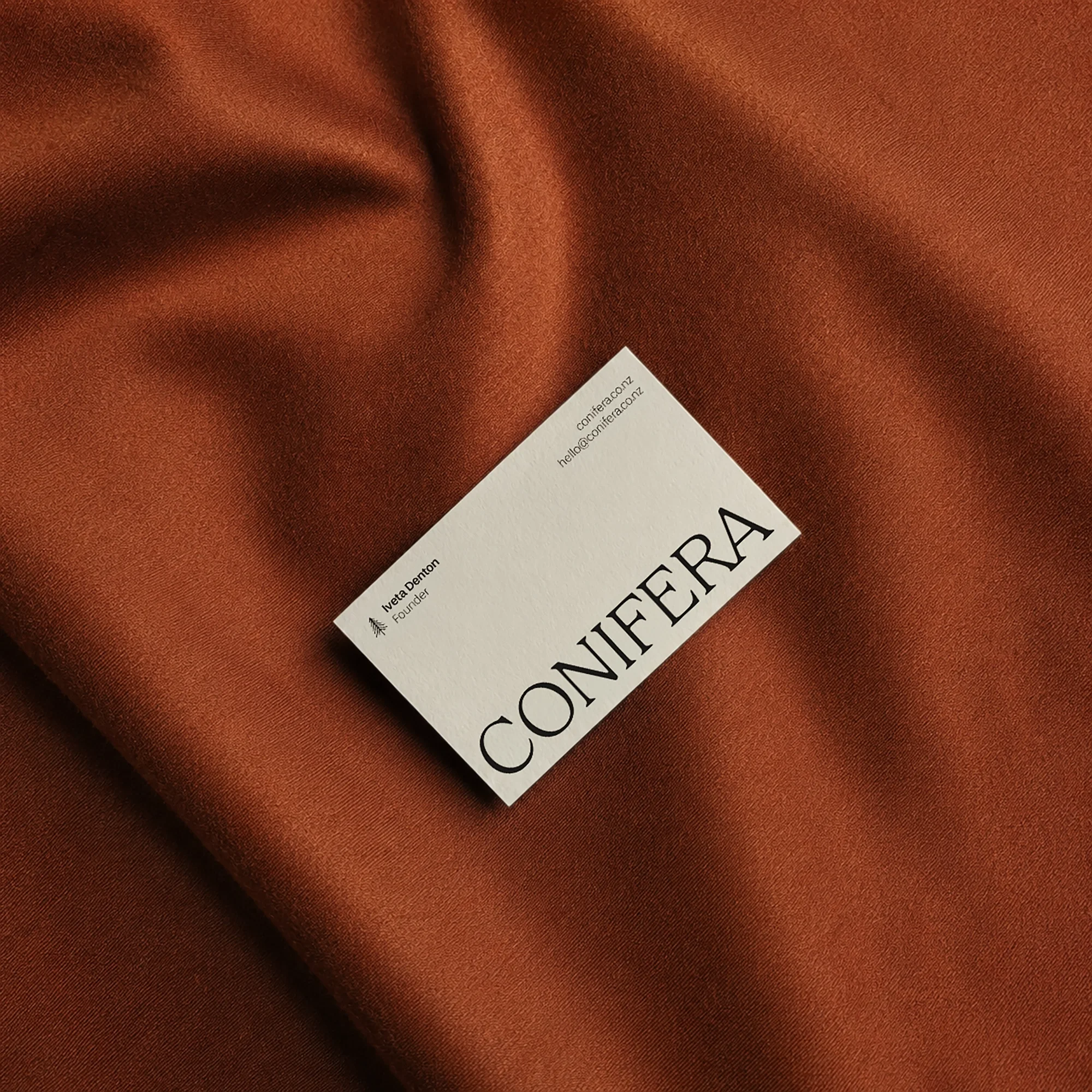
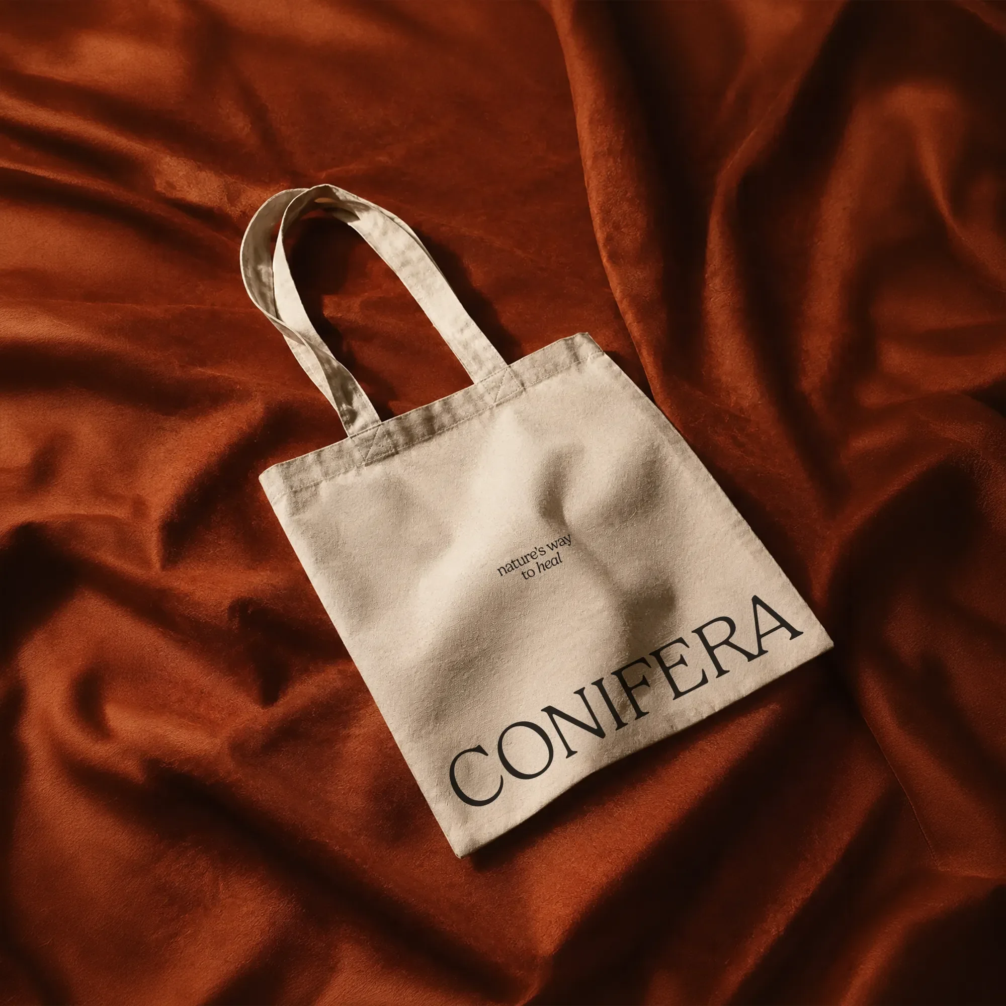
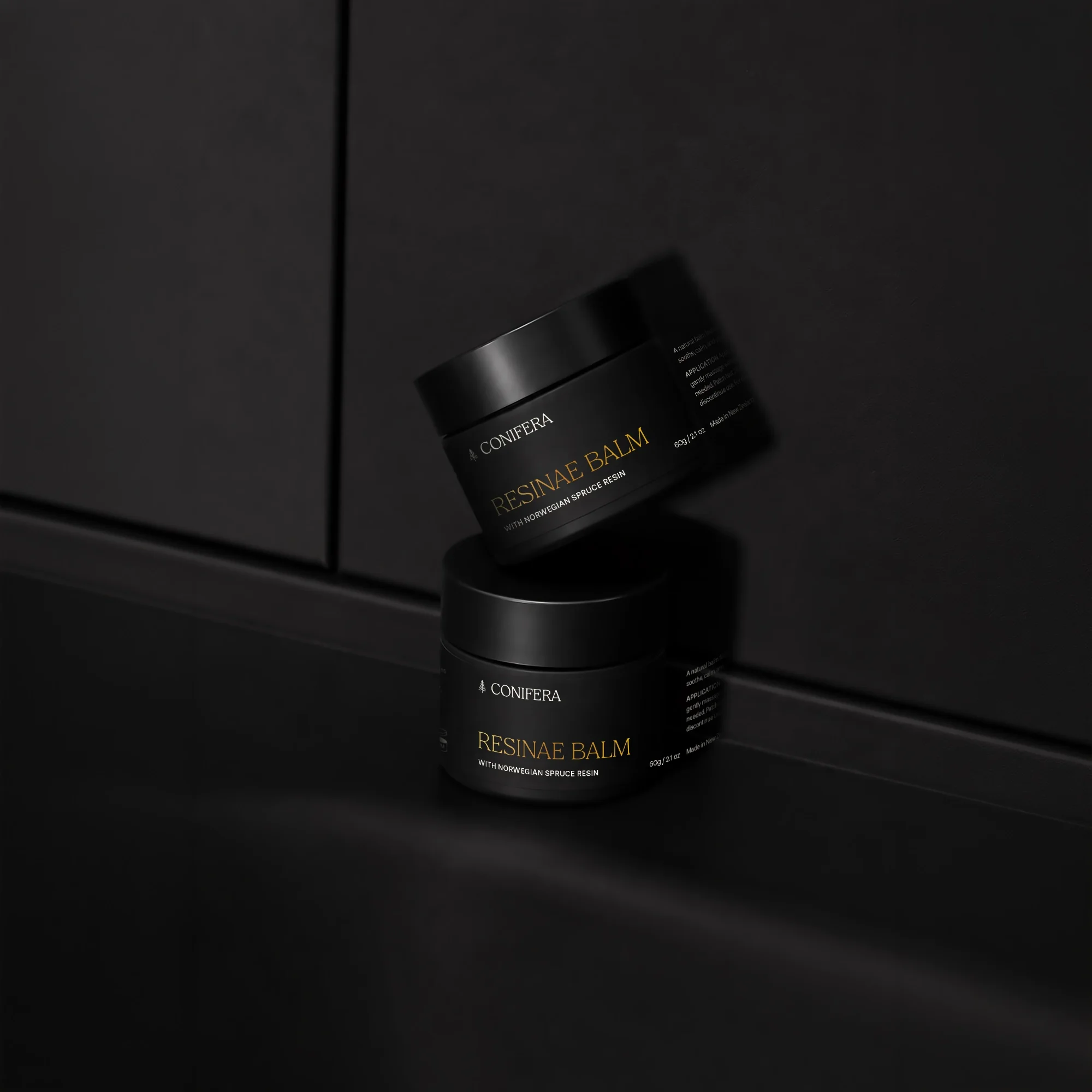
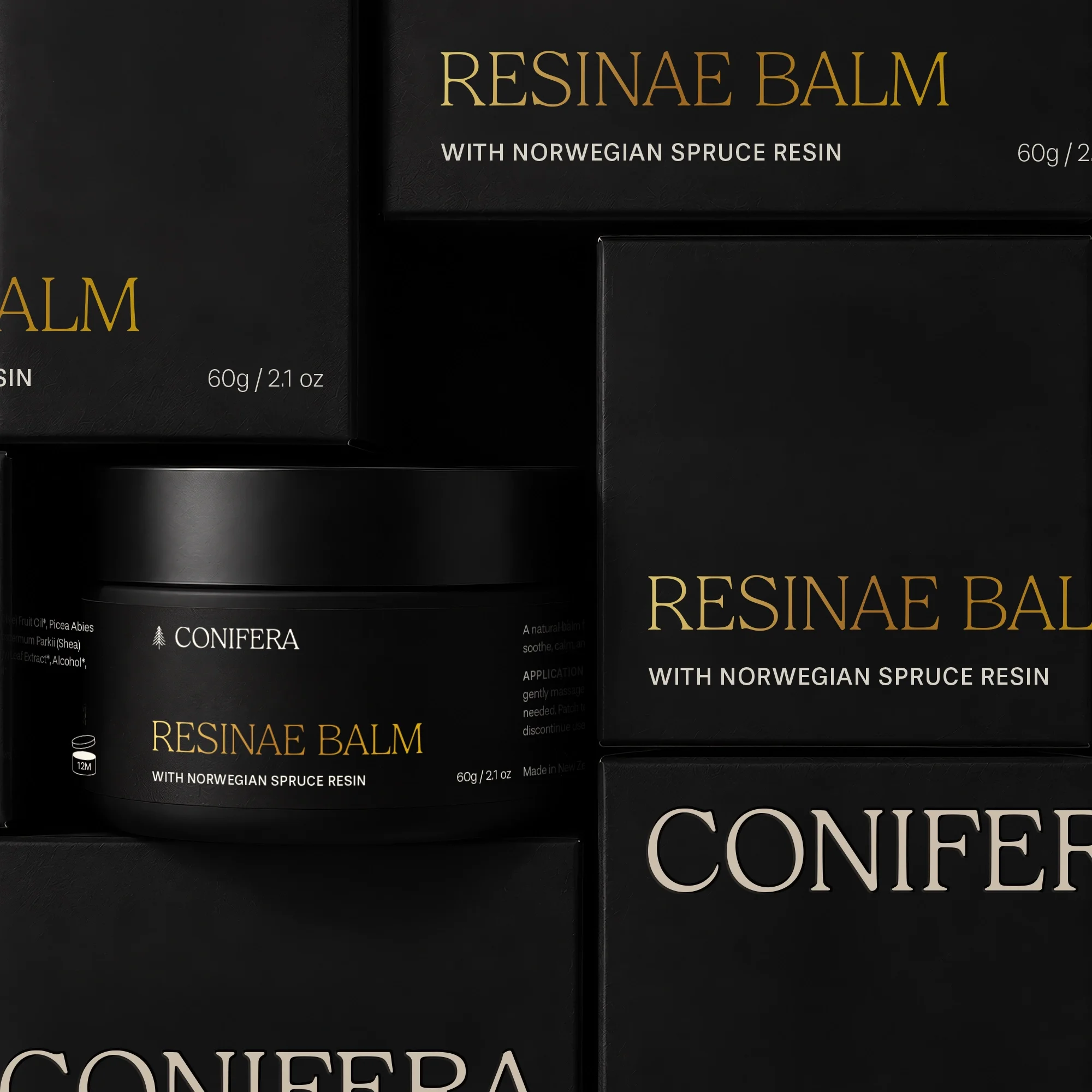
Conifera is a natural skincare brand inspired by a family remedy, using spruce resin as its key healing ingredient — a powerful, tree-derived element traditionally known for treating skin. Especially beneficial for eczema and dry, irritated skin, the brand seeks to communicate both its natural, premium quality and its connection with families who value thoughtful, caring products.
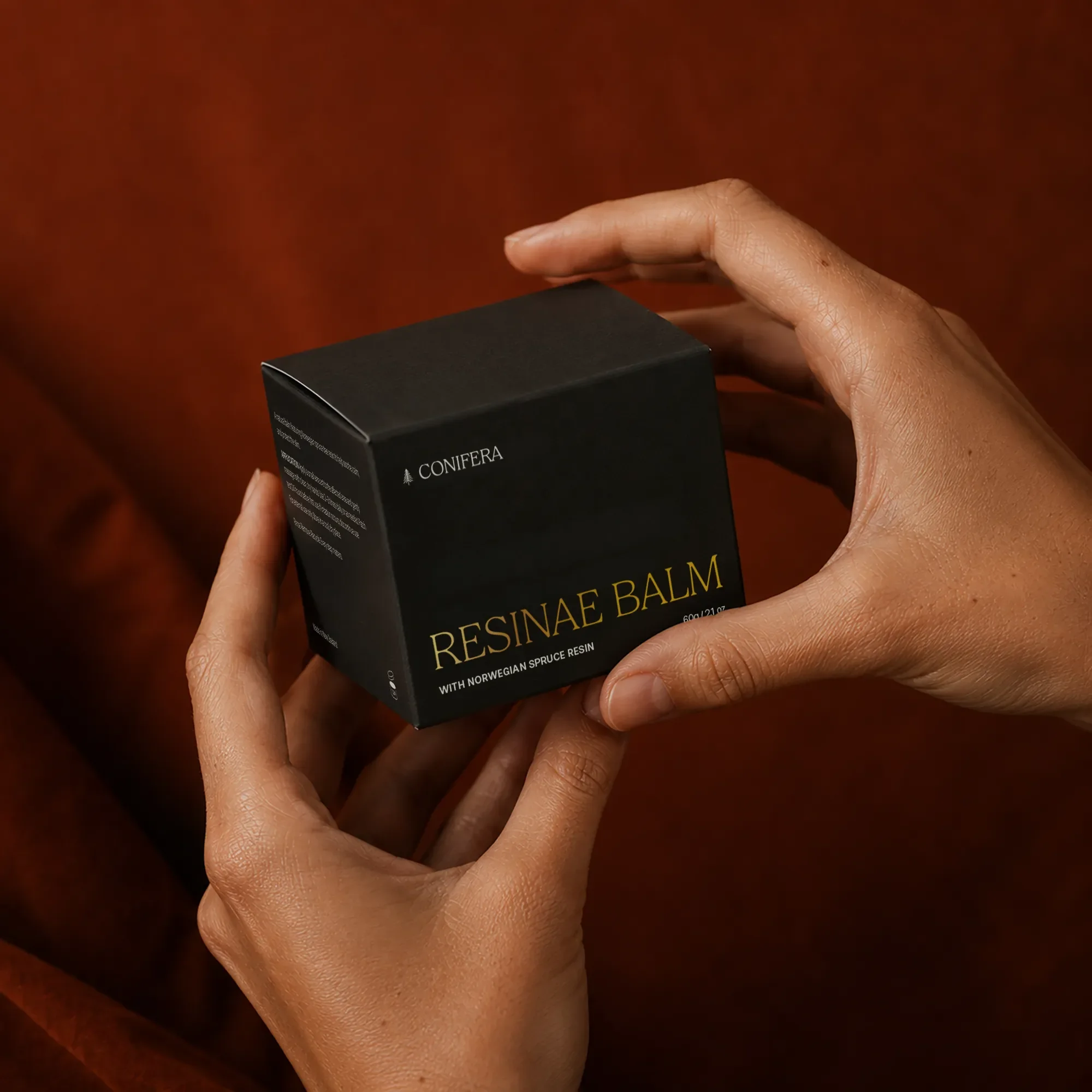
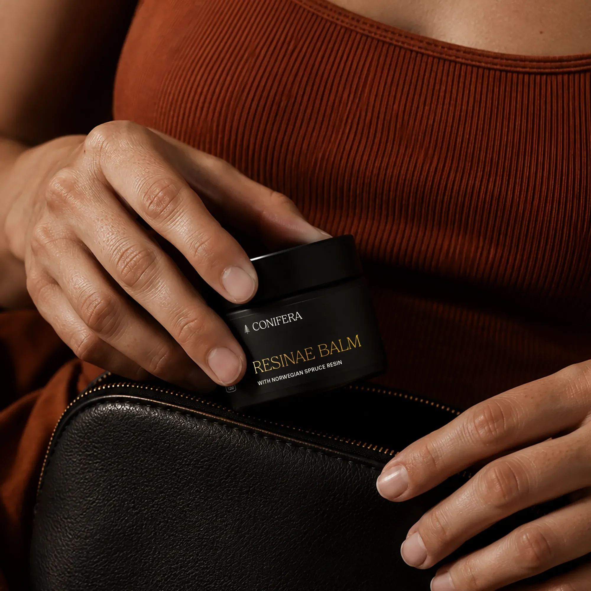
I leaned into a look that feels considered rather than clinical. The wordmark uses a classic serif — confident and a little old-world, nodding to tradition. Deep charcoal-black packaging with warm gold foil gives Resinae Balm a sense of quality and restraint, so it reads as a considered skincare product rather than a home remedy in a jar.
Auckland, NZ
Services
Branding
Brand strategy
Naming
Brand identity
Logo design
Brand guidelines
Art direction
Brand audits
Brand positioning
Iconography
Creative direction support
Ongoing brand consultancy
Business cards
Stationery design
Brochures
Flyers
Posters
Packaging design
Menus
Labels
Event collateral
Signage
Promotional materials
Digital
Website design
Social media design
Email newsletter design
Digital ads
Out-of-Home (OOH)
Presentation decks